The Light By The Fire: Why a Killer Website is Your Campground’s Best Story
We all know the thrill of a successful campfire tale; the kind where everyone’s huddled around the fire, hanging on to every word. Now, what if we told you your website could evoke that same kind of intrigue, and draw in your ideal Marshmallow Roaster? At Martrek Digital, we’re all about creating campfire-worthy websites. After all, we specialize in campground and RV park digital marketing. We’re the pros that help you pitch a perfect online tent, or roll-out your RV awning in style! This means, having the ultimate campground website checklist in hand.
The Importance of the perfect toasted mallow, visually
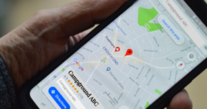
Imagine a camper scrolling on their phone, daydreaming about their next weekend getaway. Their fingers flutter over their screen, tapping and swiping, and voila! They stumble upon your website. Now, is your site a welcoming campfire that draws them in? Or is it more like a forgotten s’mores stick left out in the rain? (We all know how that feels- sticky, dirty, and gross. We abandon stick.)
Let’s face it, having a website that is optimized, SEO-focused, and mobile-friendly isn’t just a “nice-to-have” anymore. It’s as essential as marshmallows for your s’mores. Your website should truly capture the essence of your campground or RV park. After all, it’s often the first impression for potential campers. And we all want that first impression to scream, “Book your next adventure with us!”
So, here are some of the first things that you as a Campground Owner or marketing leader within an RV Park should be ticking off your checklist to make sure you are bringing your ‘mallow roasters to your site and keeping them filling your campground.
Your Campground Website Checklist:
🔥 Mobile-Friendly: Over half of web traffic comes from mobile devices. If your website isn’t ready for mobile, it’s like trying to fit an RV in a tent spot. Just doesn’t work!
🔥 Online Reservation System: Make booking as easy as a walk in the woods. With online reservations, campers can secure their spot in real-time, no carrier pigeon required.
🔥 True Essence Imagery: Let campers experience a sneak peek of their adventure with vivid imagery of your grounds. A picture’s worth a thousand yurts…or something like that. Is your campground mainly for adults, or does it cater to families? These are also important things you want to make clear on your site visually.
🔥 Optimized Content: Use words that not only tell your story but also make search engines happy. It’s like leaving breadcrumbs, and not in a Yogi Bear finding the picnic basket kind of way. Think Google and Bing.
🔥 Easy Navigation: Don’t make campers hunt for information. A well-structured site is like a well-marked trail. No one gets lost, and everyone has a great time!
Pitching the Perfect Tent (digitally speaking):
If all this talk of SEO and optimization sounds like having your awning rolled out in a windstorm, don’t fret. Martrek Digital is here to guide you through the forest, just like this campground website checklist. We’ve helped countless campgrounds and RV parks blaze a trail online, ensuring they don’t just survive but thrive!
So, camp commanders, if you’re looking to build a new digital campground, or simply spruce up your existing site, let’s chat. Reach out, and let’s schedule a call. At Martrek Digital, we’re all about helping you light up the online wilderness to keep you on top of your game when it matters most – converting those searches to site bookings.
Ready to download your full FREE checklist? Get our Ultimate Guide HERE!

